Wanna design for AR, MR, VR or all the RRRs? What are you- some sorta pirate???? Let’s do this!
Am I recommending these interaction methods? Not necessarily. But they have been built by brilliant engineers over at A-Frame and Mozilla. Before recommending new ones, maybe let’s focus on making AR and VR useful to people.
Enough said. So you have a killer app idea? Well then…let’s do UX wireframing, not design. And don’t be fooled. You could be the worlds BEST spatial computing designer and only use a pencil and paper. Tools come and go but vision and empathy remain. Vision is typically a result of empathy so — just develop empathy. I use google slides cus I stink with a pencil!
- Use simple lines and geometric shapes
- Use occlusion
- Don’t use materials, color, or high level of detail
- Show relative size
- Use simples shadows
- Show the reticle or interaction
// Use simple lines
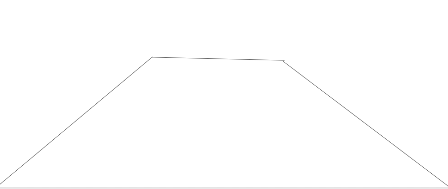
Don’t go look for 3D models on google poly or turbosquid. Just sketch it yo!
// Greybox with simple shapes
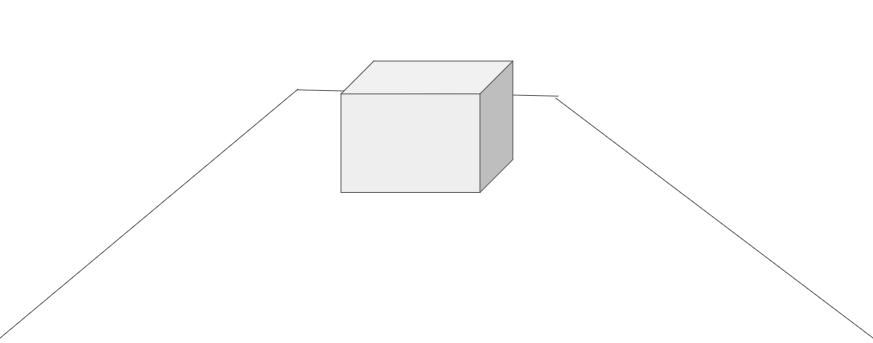
Abstraction let’s you move fast! Just don’t show it to the CEO or end user until they are like,” Oh that box represents my entire fortune 100 brand? ok let’s design together!” (Ignore your jaded colleagues — the CEO is ALWAYS a designer — just think inception and you will succeed!)
// Use occlusion
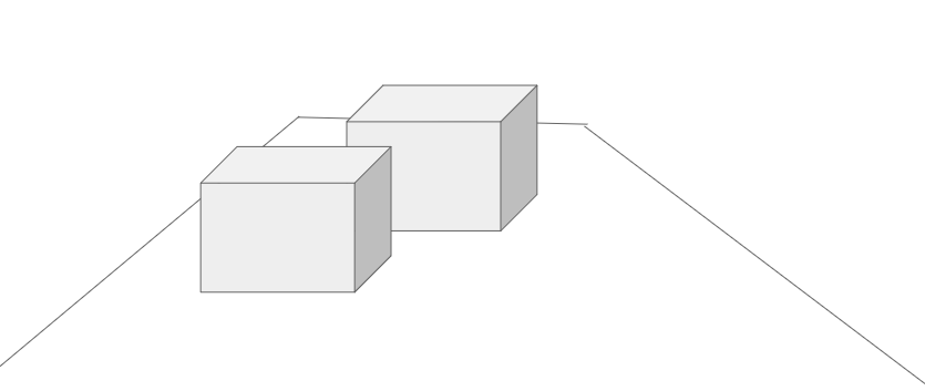
Basically block one object with another object. Don’t get lost in the terminology or endless design discussions. Create and leave the philosophy or perceptual science up to the others. Creativity is king and queen— not big words.
// Don’t use materials, color, or high level of detail
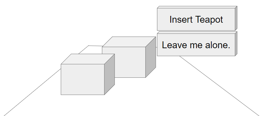
Think 2D design is tricky? This is orders of magnitude harder and you don’t want to spend the whole day learning to 3D model or use Unity. Ok…you do…but do this for 2 hours and then you can do that other dope stuff.
// Show relative size
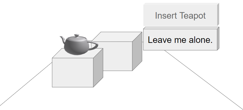
We all know how big a teapot is — unless you grew up in a country that forbids them. Always ask yourself, what is the simplest visual resource that I don’t have to recreate or won’t get in trouble with the lawyers for using copyrighted junk (use pixabay- they rock). Work fast. Work simple. But keep the object you use conceptually and contextually VERY relevant to your audience (probably a senior manager who has so many fires to put out that they are write #smh on slack as you present what you think is a genius interaction or application flow.
// Use simple shadows
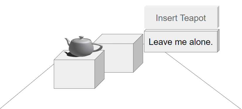
Why do groundhogs come out? Wait…what happens when…wait…this is a bad joke. Just..use shadow. It makes objects float less and seem more grounded. Just do it.
// Show the reticle or interaction
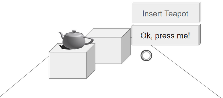
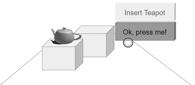
People…all your colleagues see here is boxes. A lot of them probably want your job and wonder what it is that you do. Don’t be lazy. The more detail you can provide that lowers the amount of mental guesswork they do the less they will scratch their heads and just get to building your glorious vision.
Practiceeeeee!
Ok, sure…you can have the google slide……
Wanna see more rad stuff? Follow me on Instagram!!!!
….for instance…… we (me) is gonna show you what you could do with augmented reality IRLLLLLLL (InRealLLLLLLLife )(I’m about 3 cups of coffee in right now. Forgive my blatant disregard for grammar. Who wants to stand on ceremony anyhow?)


